Sonata Gourmet Oils
This project was a collaborative rebrand for Spectrum's line of organic cooking oils. UW-Stout and Great Northern Corporation partnered to create this collaborative experience for packaging and graphic design students. Cross-disciplinary teamwork was utilized to complete the project's objective, involving a different product brand each year. We were divided into teams of two graphic designers and two packaging students. As a team, we developed a cohesive brand identity and structural packaging system for a multipack featuring olive and avocado oil aimed at both the club store and e-commerce markets.
Packaging students focused on structural design, e-commerce readiness, and dynamic testing, while graphic designers led visual identity, marketing research, and print production. Our group's goals included creating new branding, label designs, and packaging graphics for primary, secondary, and tertiary formats. The project emphasized consumer clarity, shelf appeal, and Costco and Amazon SIOC packaging requirements compliance. This rebrand was aimed at simplifying the shopping experience, encouraging culinary exploration, and elevating Spectrum's presence in a competitive market.

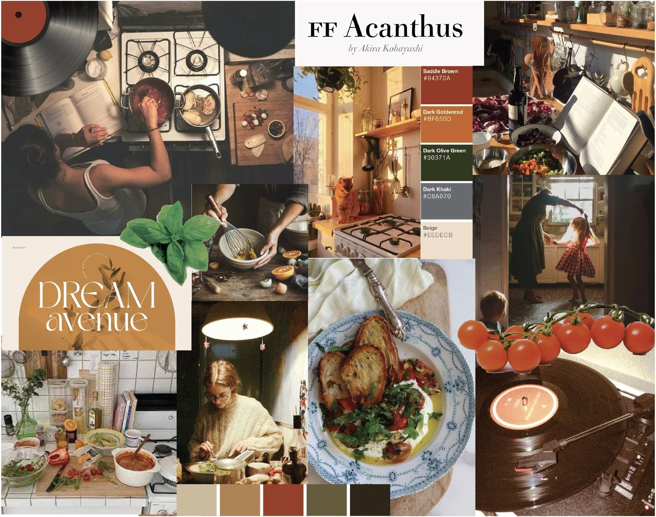
The theme we chose to bring to life for this rebrand was incorporating music into cooking. We wanted this to be more of an experiential gift multipack to help emphasize the experience of cooking at home, whether you are cooking alone or with friends and family. We wanted to reflect our keywords of being engaging, nostalgic, lively, and comforting with a warm home feel. We accomplished this rebrand of Sonata in four phases.
-
Established packaging goals, analyzed competitors, and created initial concepts for primary, secondary, and tertiary packaging. Developed early branding and mood boards.
-
Designed consumer personas, explored themed packaging ideas, refined logo and graphics, and created structural sketches for multipack, tray, and pallet.
-
Built and tested packaging prototypes, improved designs based on performance and user feedback, and advanced graphic development.
-
Completed final designs for all packaging tiers, ensured compliance with retail and e-commerce standards, and applied cohesive branding across all elements.
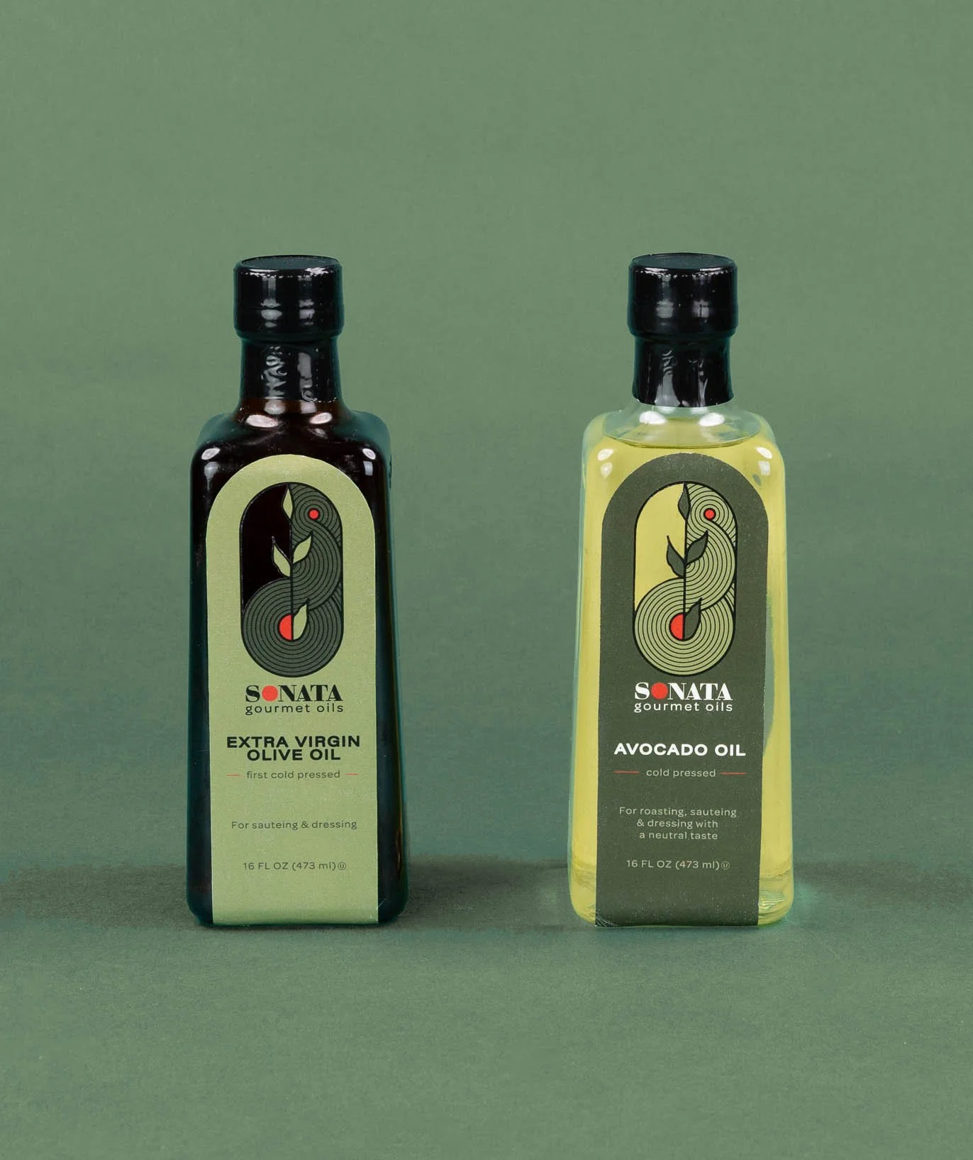
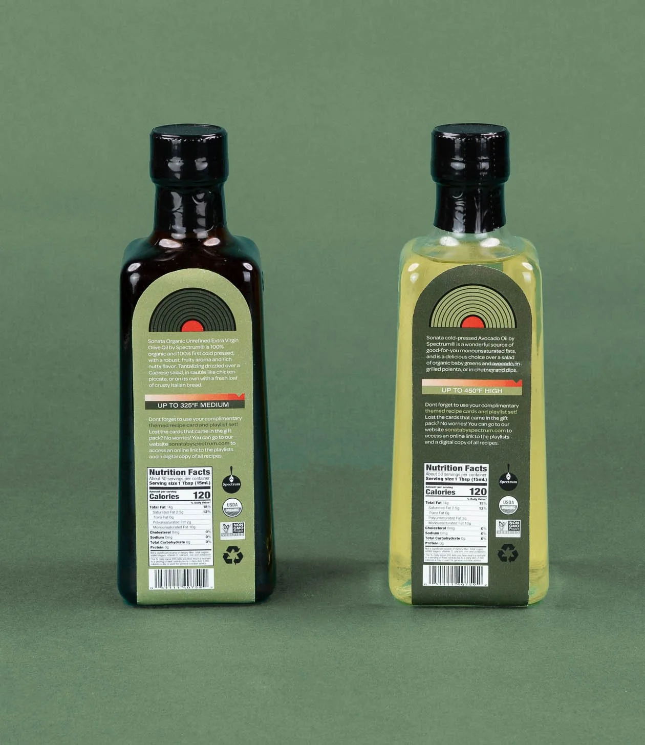
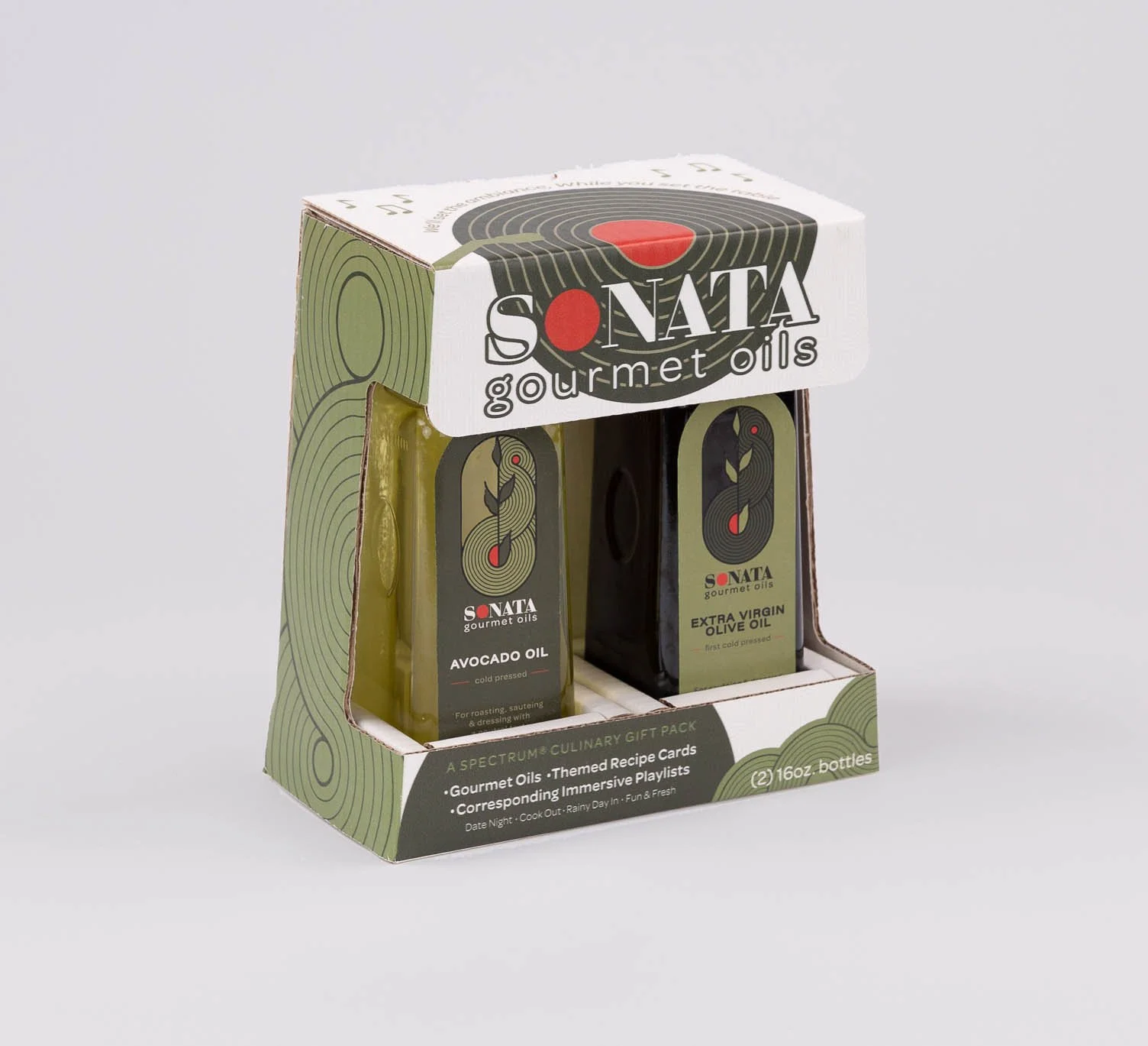
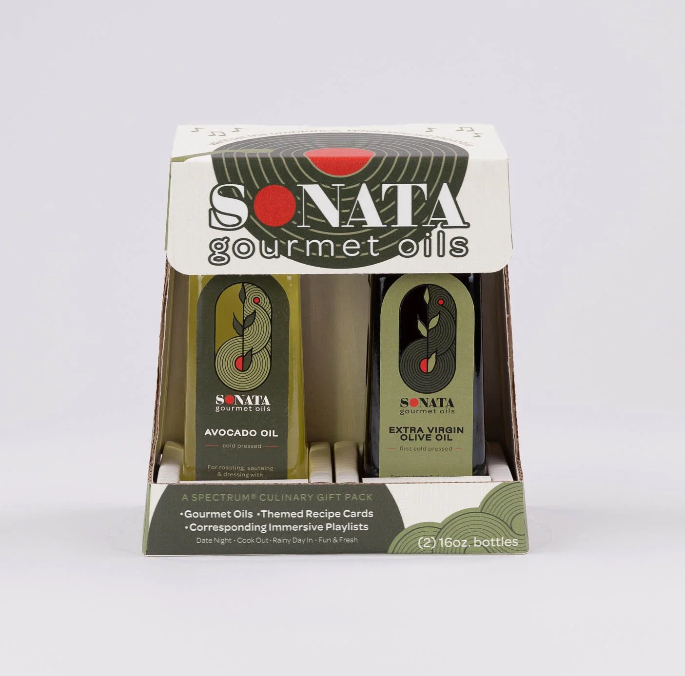
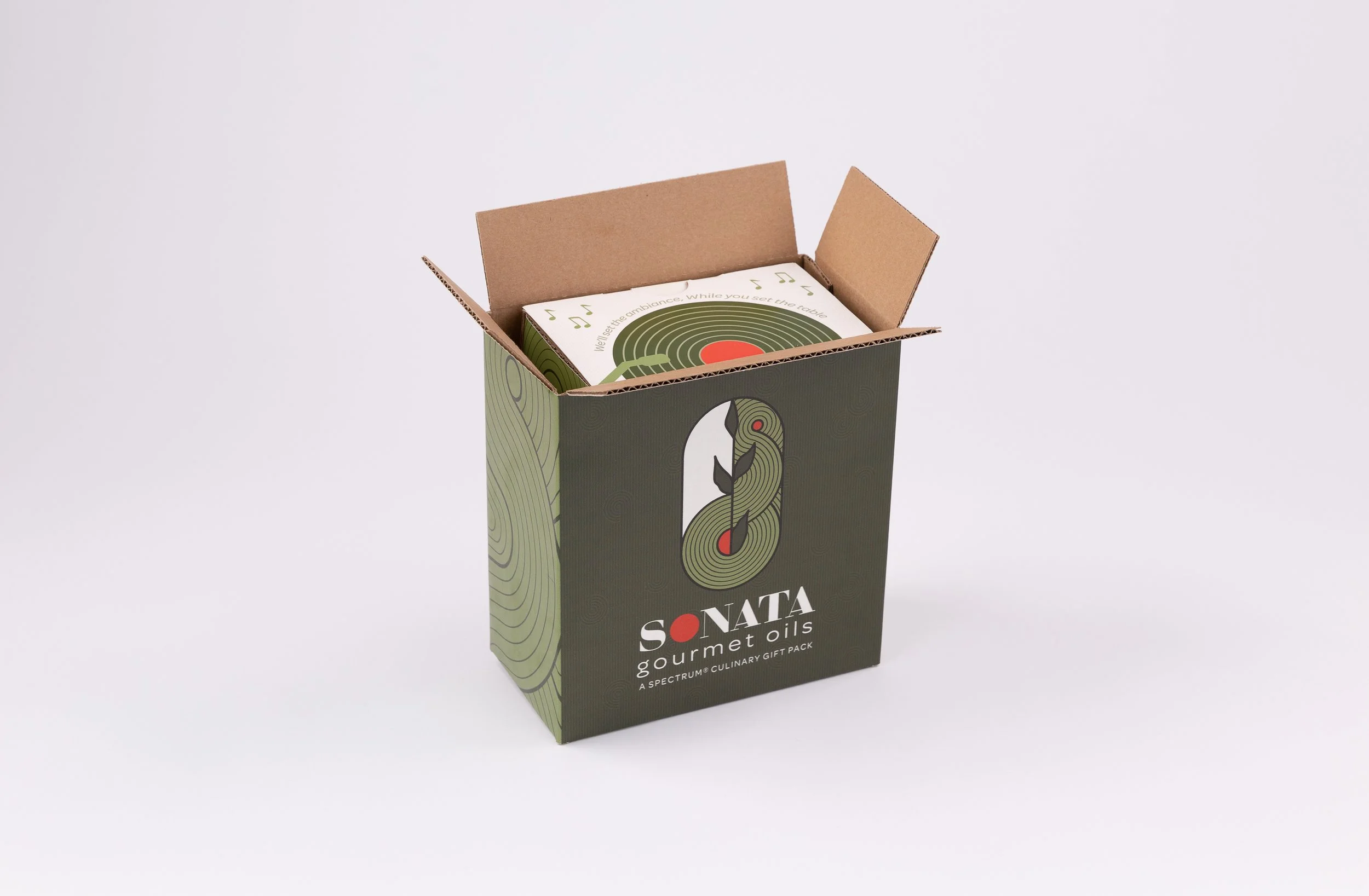
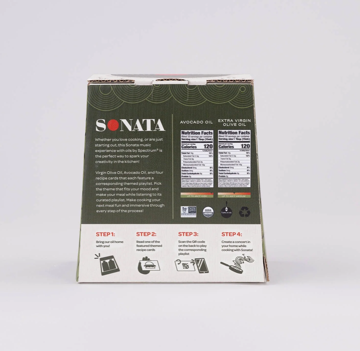
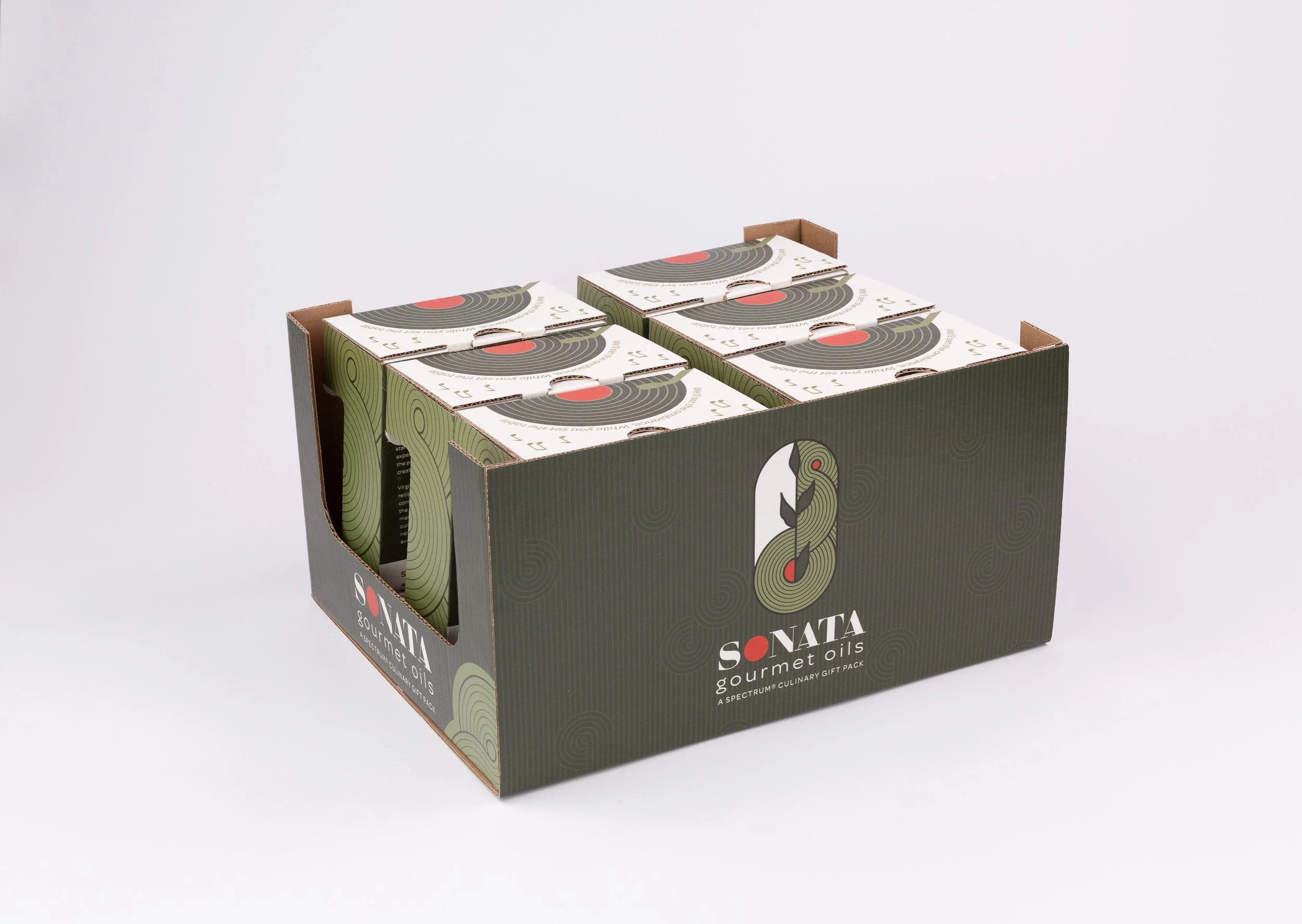
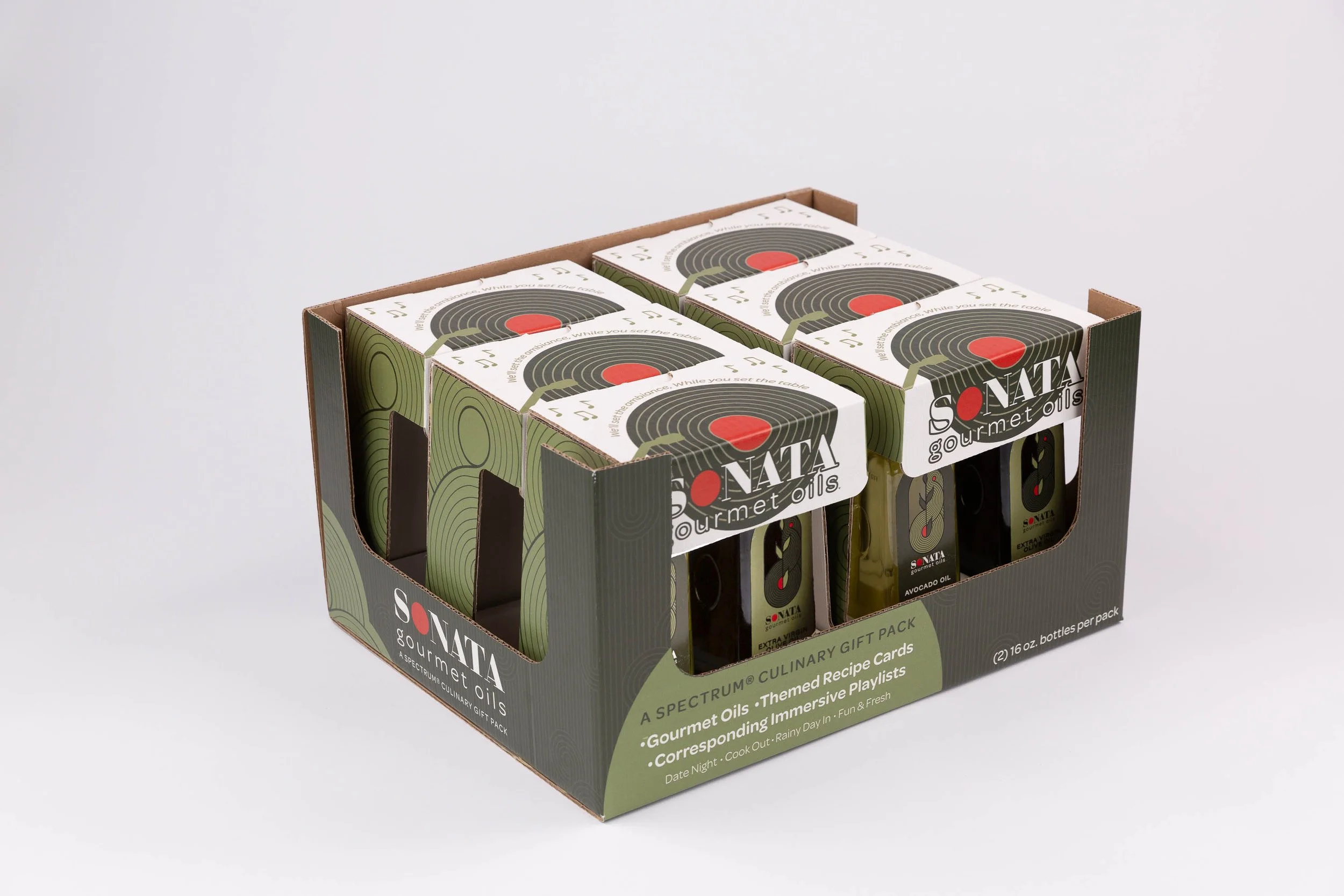
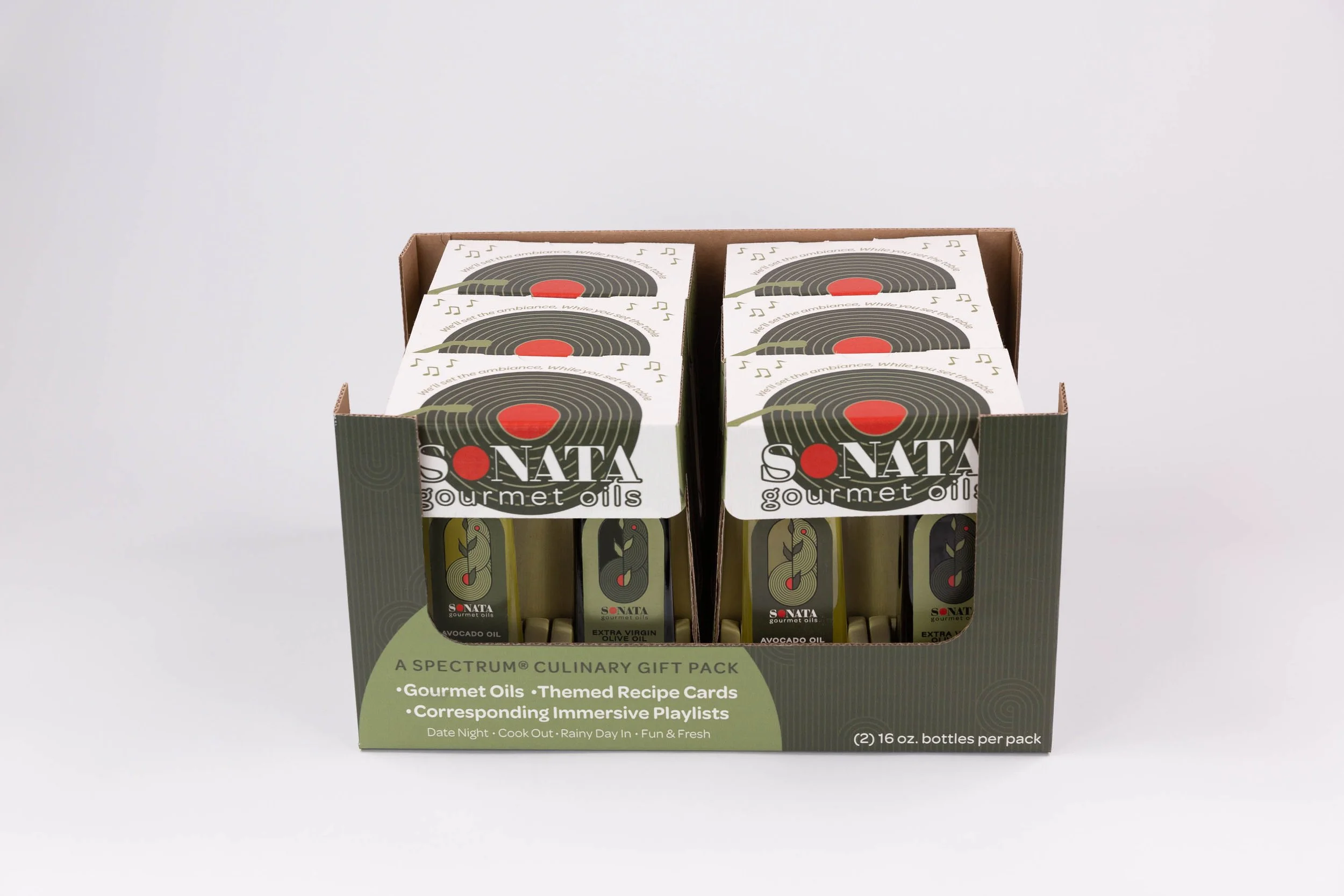
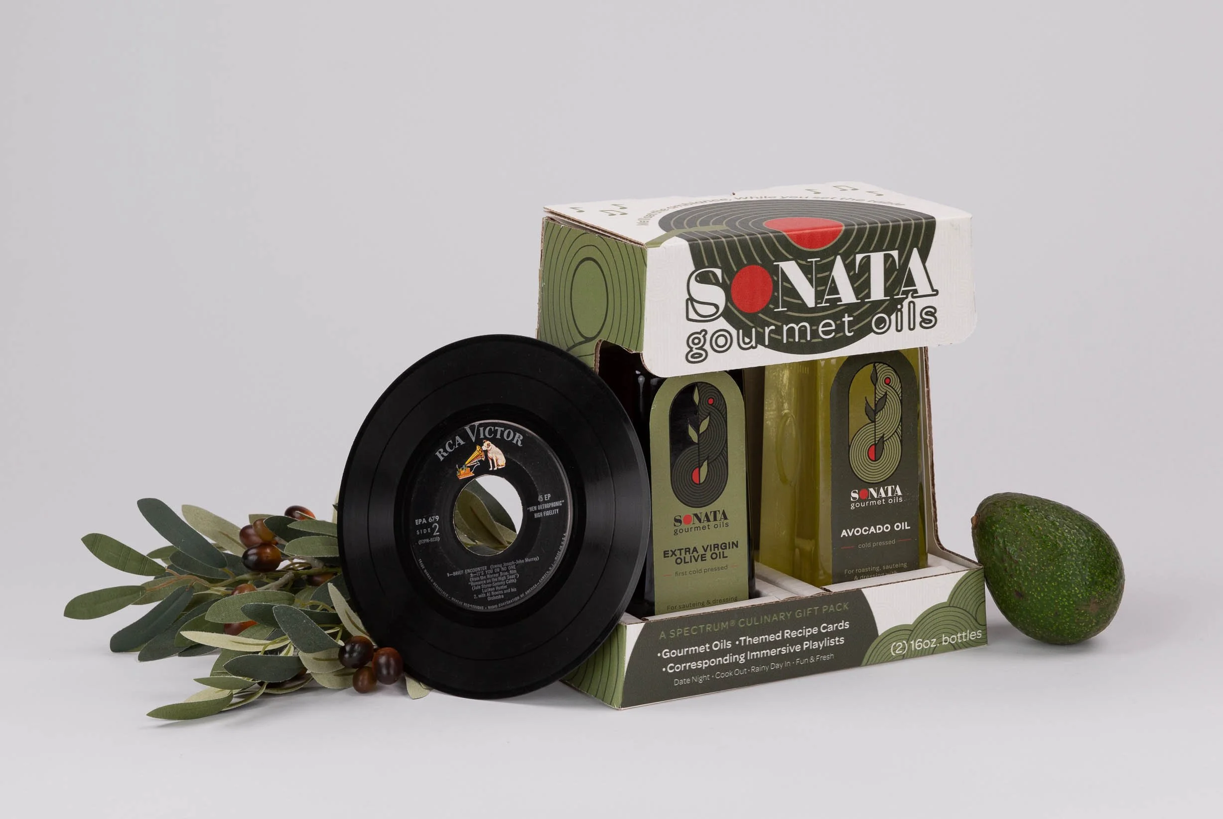
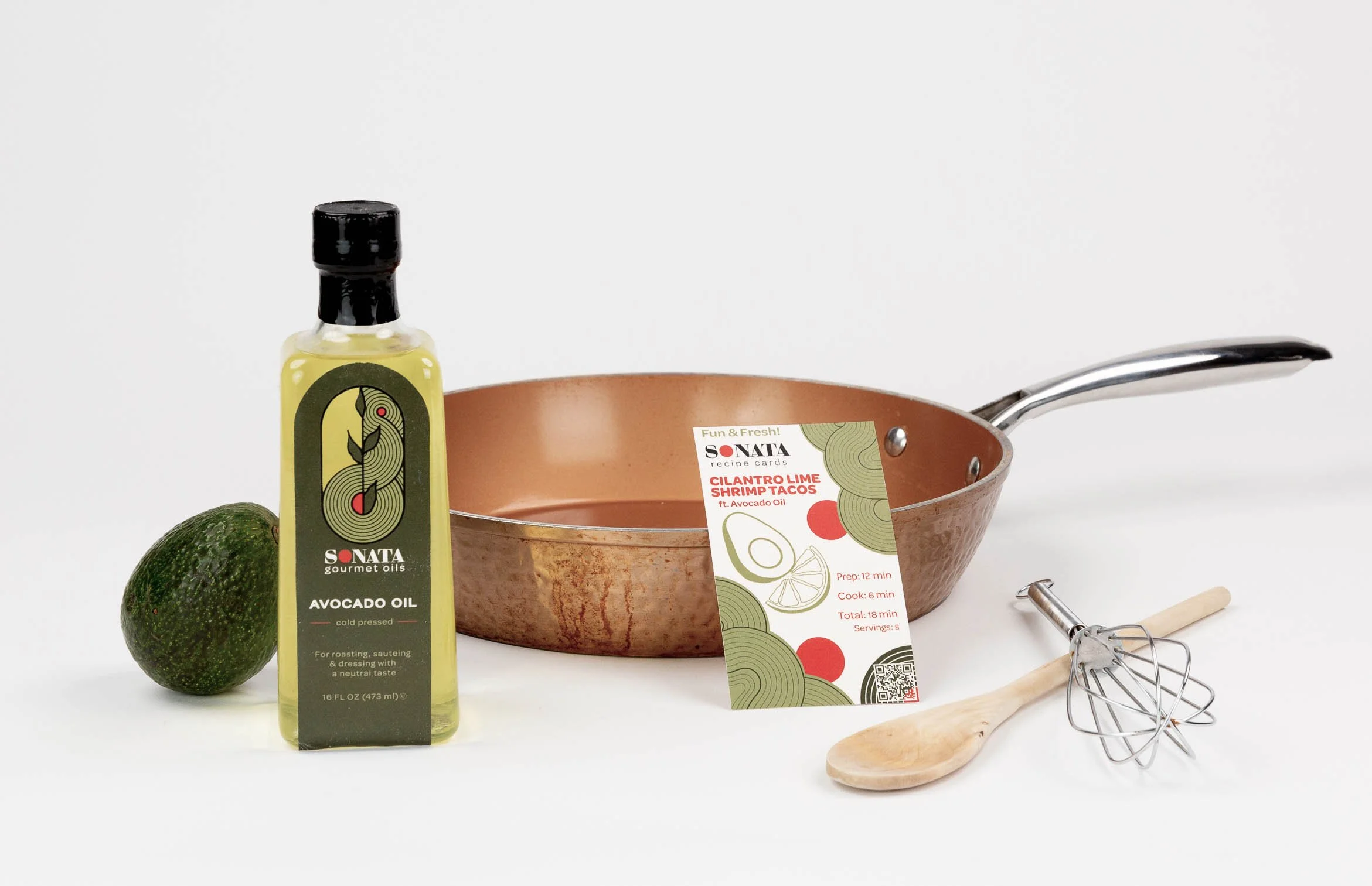
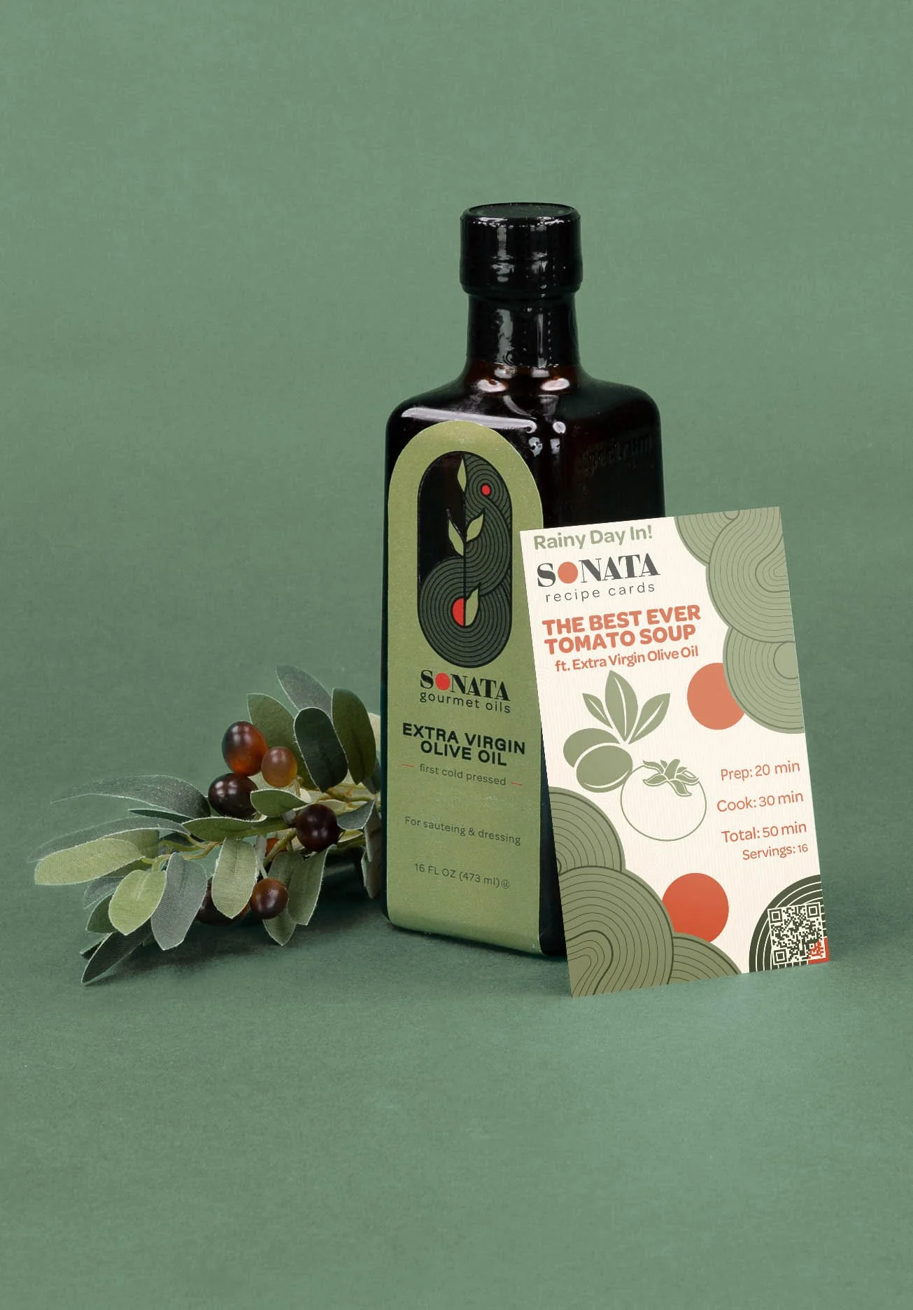
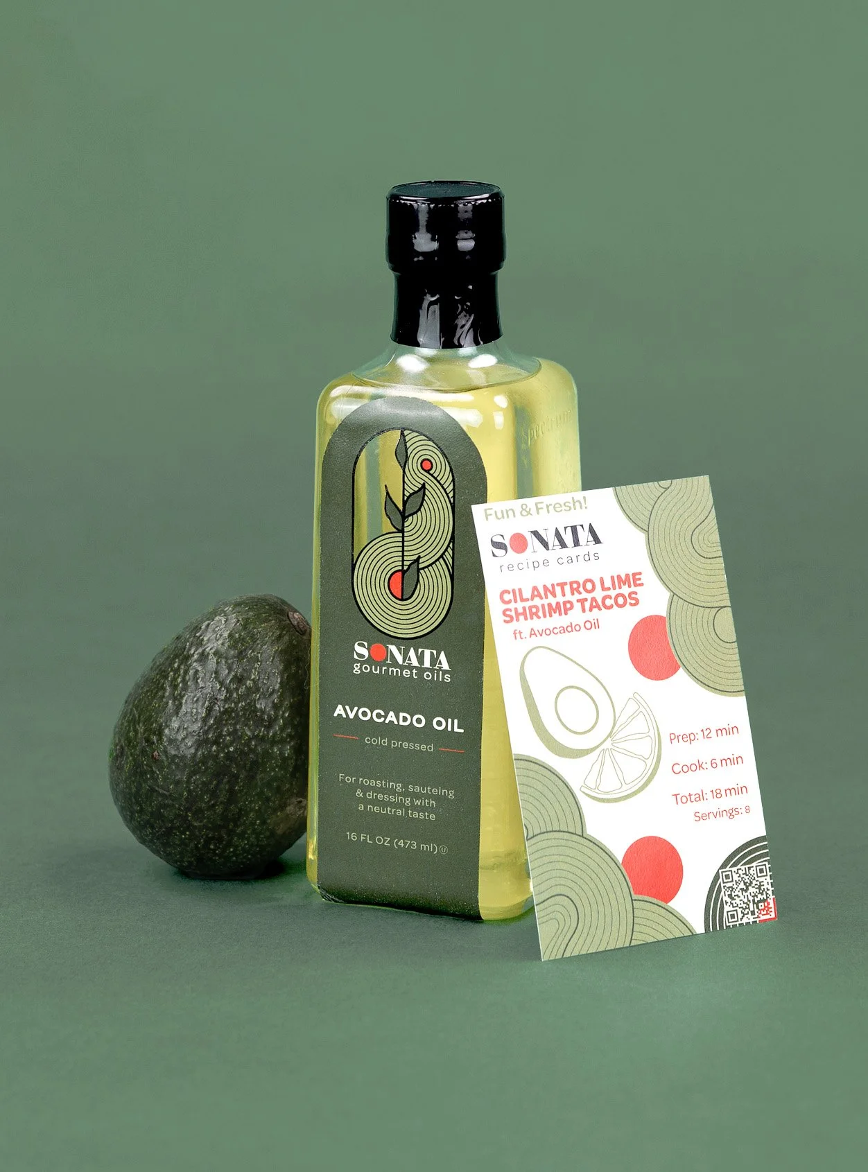
Our brand identity elements were designed to combine a representation of music and the plants of olives and avocados. In our logo, we wanted to show the more geometric and structural record motif and the organic lines to mimic the plants. There is a record on the bottom with a sun rising over the field on the other side. We then took the record lines and manipulated them to create a swirled line design. We used this swirl design as a part of our package designs on our other applications, such as the multipack, the e-commerce shipper, and the pallet tray. We also created a subtle line pattern to fill the negative space and keep everything cohesive. We tappered the top of the multipack to follow the same shape as the oil bottles.


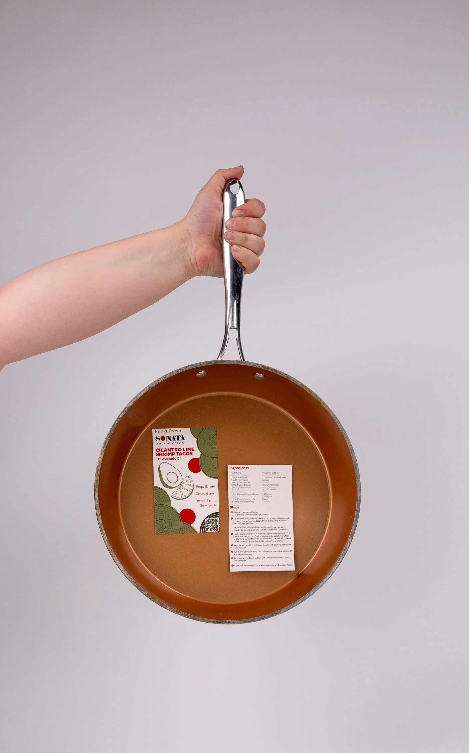
To further our music-focused theme and the vision for this multipack as an experiential gift multipack to help emphasize the cooking experience at home, we created a set of recipe cards. We had four themes: Date Night, Rainy Day In, Fun & Fresh, and Cook Out. The cards each come with a scannable Spotify playlist QR code to play when you cook that accompanies the corresponding theme. These cards would be included in every multipack, with two recipes featuring olive oil and two using avocado oil.