Serigraphy Printmaking: Play
“DQ’s Next Branding”
The task for this project was to use “Play” as a theme and explore the process of bitmaps. As a theme, “Play” was to be interpreted into a narrative that demonstrates an example of the theme, or “Play” can govern the manner in which the process of printmaking is explored.
I chose to use photos I had taken and explore color with this piece.
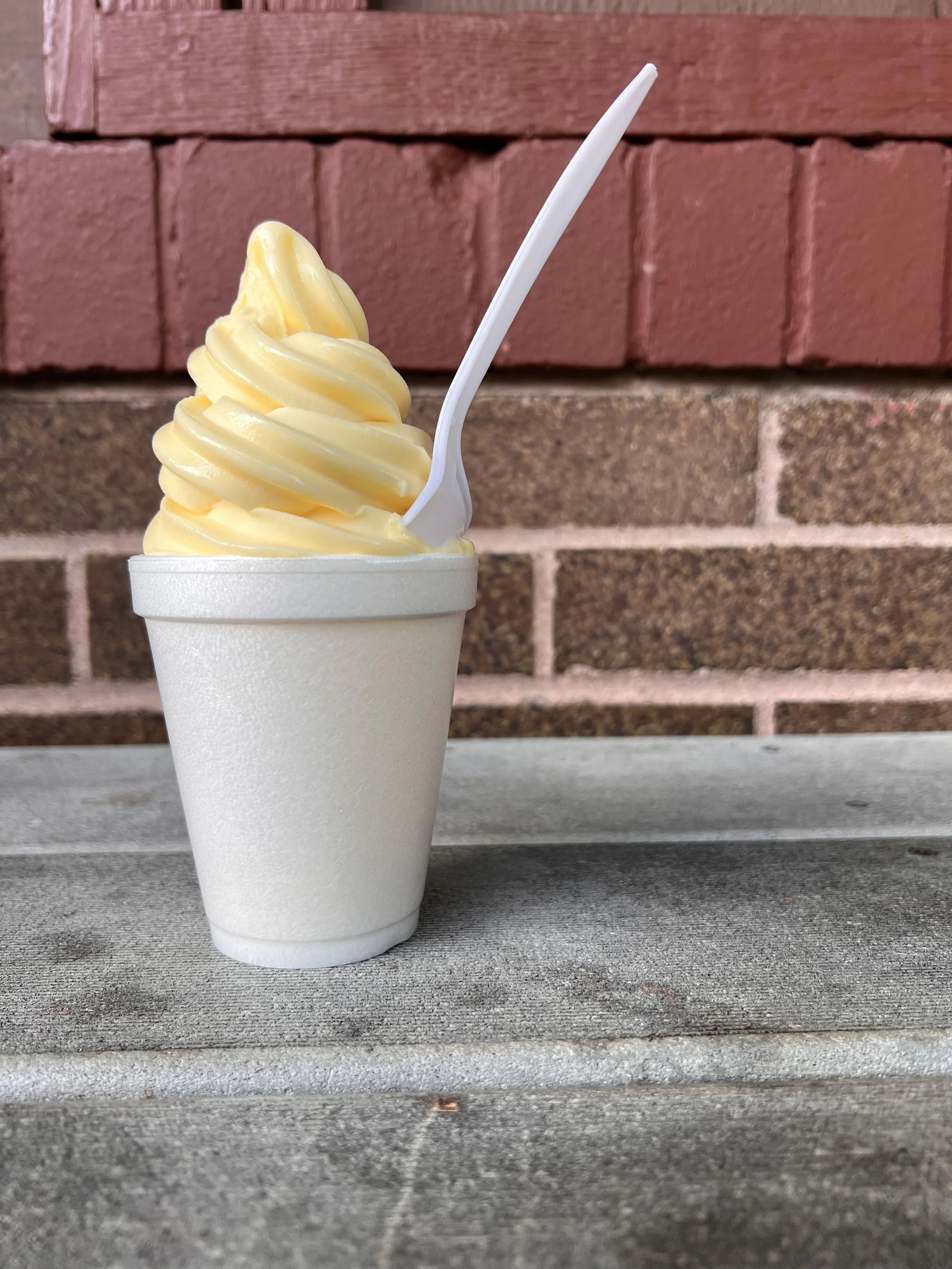
I started by duplicating the photo to output different-level bitmaps for each layer I wanted of the piece with the 50% threshold option.
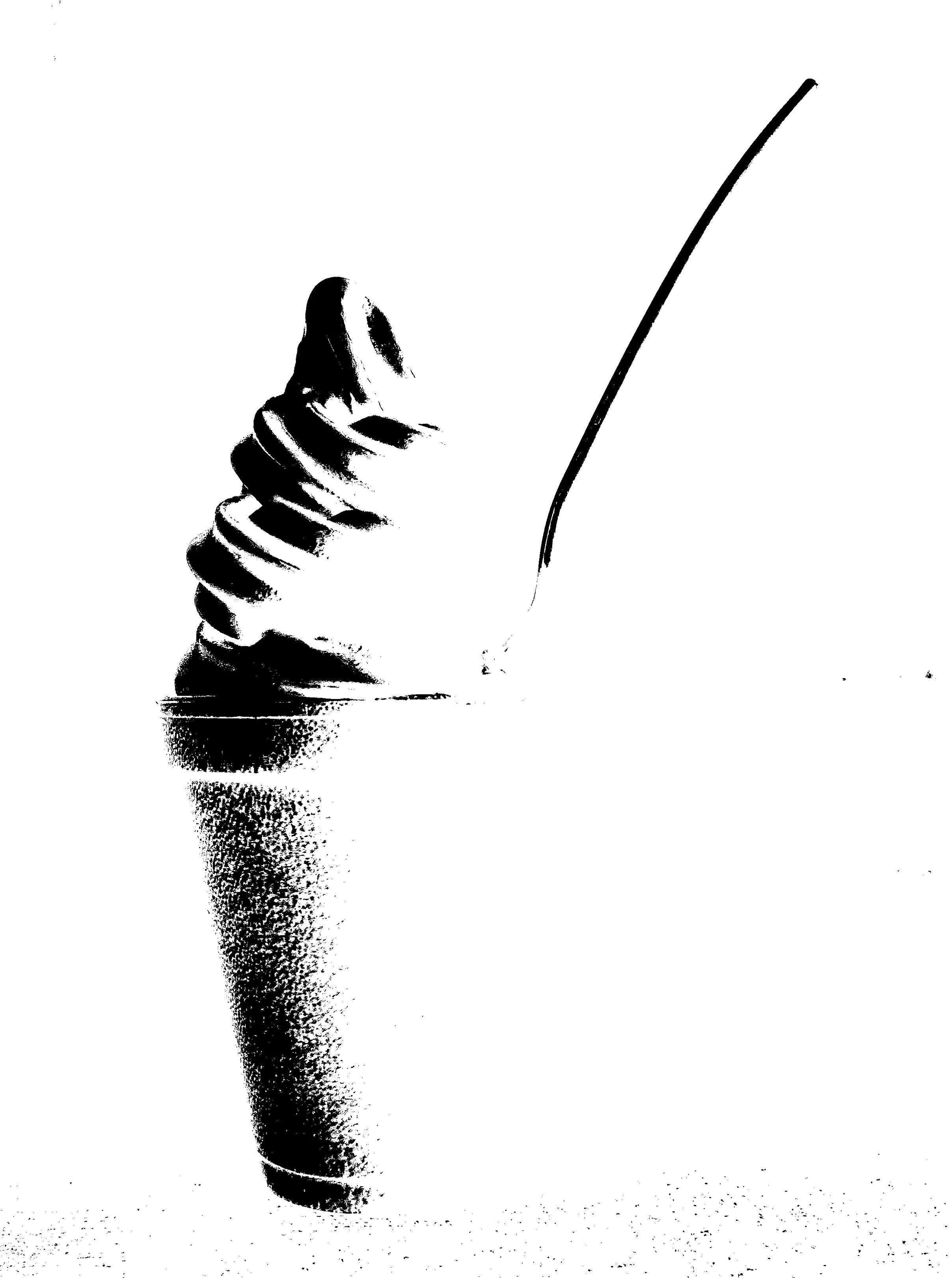


The next step was to work on a fun background that was unlike the shapes made by the bitmap of the ice cream. I also did not want to design something that would not detract from the main subject of the ice cream.

The final step was to choose the colors and start the printing process.
I chose gold, red, and a mixture of purple and blue for the ice cream layers. I put gold on the bottom to pull the eye in and layered up from there. I choose a mixture of turquoise and lime green for the background to help the gold layer pop.
